Maps
A chloropleth map is used as a way to visualize how a certain measurement is different over a geographic area. Chloropleth maps most commonly use colors or are shaded to show the measurements of what is being displayed in the map. The above chloropleth map is showing the "Estimated Median Household Income," obviously throughout the United States. The different colors represent the different measurements of the amount of the median income in certain areas. For example: West Virginia is the lightest shade of pink, therefore the estimated median income for West Virginia is between $37,404-$39,127.
A dot density map is a map that displays information by using a large quantity of small dots. Each of the dots represents a specific quantity of a certain unit. The dot density map below shows the "Statewise Population of the United States in 1999." Each dot in the map stands for 15,000.
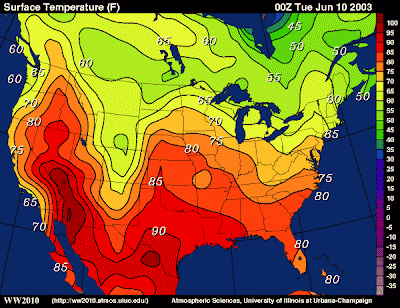
An isopleth map uses lines with meeting points to show variations in values. The above isopleth map displays surface temperatures throughout the United States. Each color in between the two lines portrays the temperature.
Environmental sensitivity index maps are mainly used to display sensitive shoreline resources before an oil spill, in order to set up a plan for protection and clean up. The above environmental sensitivity index map uses symbols to portray the animals or objects that are to be shown in the map.
Click here to see an animation of Hurricane Katrina's lifespan.


No comments:
Post a Comment